


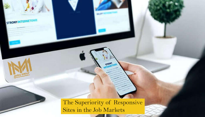
designing a responsive website means that the website pages are displayed well on a variety of devices and screens.
Nowadays, as the usage of digital devices, gadgets and responsive mobile phones is increasing; the importance of responsive website in today’s competitive world of business is more than before.
Responsive sites have identical internet address (URL) on all devices, while the mobile version sites are basically two different websites with two different addresses that only have identical content.
Google prioritizes responsive websites for review.
Another advantage of having responsive website is that since the address of all pages and sections are identical, audiences are able to communicate better.
To examine the responsiveness of a website, Open the website on a computer or laptop and then decrease its width, if a mobile phone or tablet is out of access for the time being. If the website is responsive, all the contents should be resized in accordance with the new width that turning the page horizontally to see the content would not be needed.
Website user friendliness is considered as the main criterion for the website to be ranked high by Google. Responsiveness is also a part of user friendliness of the website.
Google penalizes sites that are not responsive, and naturally these sites cannot rank high in Google.

Taking into account the websites can be restored down (decreased in size) in mobile and tablet and the fact that sometimes some elements are removed in mobile version, the volume of data is reduced and thus increases the speed of the website. This point is very important for mobile phones and tablets, which often have slower internet speeds than PC and laptop.
Before the wide application of responsiveness feature, people had to design two different sites to be accessed by computers and mobile phones. After the tablets were introduced, non-responsive websites had to be designed separately according to the dimensions of tablet screen, which meant three separate costs for an equal content. However, the concept of responsive website caused it to run on a variety of devices and screens.
Despite that the responsive sites are much more widespread than before, many websites are still non-responsive. This means that if your website is responsive, in addition to the benefits mentioned above, your site will overtake the competing sites which are not responsive yet.
Every website designed by Amina Group, including stores, companies, etc., are all responsive and run properly on all screens. In Amina, we design your website in a completely responsive way with a variety of digital devices and screens. This has huge impacts on user satisfaction of your site and consequently your SEO.
Nowadays, a wide range of tablets and mobile phones are available in the market such that a large number of new digital devices are introduced to the market on a monthly basis, which means that without a responsive website, you will have practically no place in the strong competition on the Internet and world wide web.
Contact us so that our experts would guide you to set up your website.
